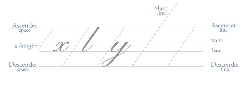
Hello and welcome to our first blog post! In this blog we will be talking about the basics of hand lettering and the simple materials you may need. If you are a beginner to hand lettering then this is a good place to start. First off, lets talk about the materials you may need. Materials needed to start are a brush pen, paper, and a pencil. You could also use a fountain pen, but in this post we will be specifically talking about brush pen calligraphy. Now lets talk about x height, ascenders, and descenders. Below we have inserted a picture that explains what these terms mean. The x height is the normal size of a lowercase letter and some examples of x height letters would be, a, c, e, o and etc. Ascending letters go above the x height and some examples of this are h, k, f, l, and etc. Descending letters are just the opposite of ascending letters, so instead of rising above the x height, they have a tail that goes below it instead. Some examples of descenders would be y, z, g, p, and etc.
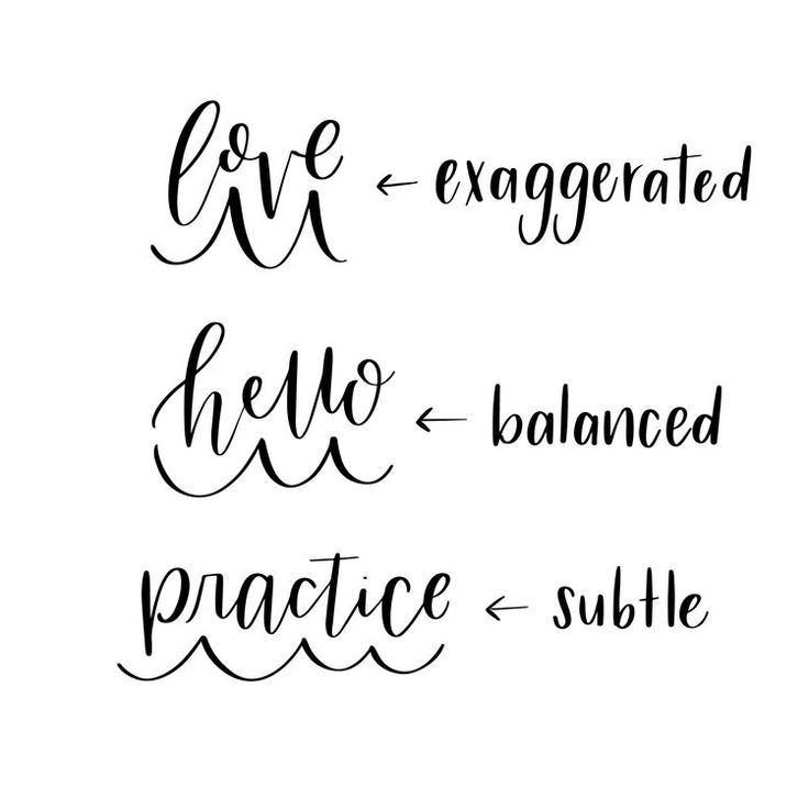
Now that you’ve learned all about x height, lets talk about the baseline of you lettering. This is very essential to your hand lettering style. For example, you can change up the base line and instead of all the letters following a straight line, you can cause your letters to go up or down creating a cool effect. The picture below shows different examples of more subtle and exaggerated ways of doing this.
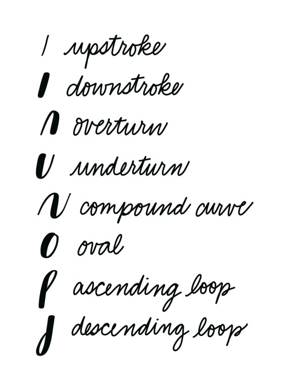
Great! Now let’s talk about how to actually create the cool calligraphy effect with your brush pen. First of all, you need to understand what down strokes and up strokes are. Up strokes are the part of the letter where you drag you pencil/pen up and down strokes are the parts of the letter where you drag you pencil/pen down. Your brush pen is specially made to have a flexible paintbrush like tip that enables you to use different amounts of pressure to create cool effects and the way you create this effect is very simple. Just drag the tip of your pen lightly upwards on your upstrokes applying little to no pressure to create a thin line, and on your down strokes, press down with the side of your brush pen to create a thicker and bolder line. And there you go! That’s how to achieve brush pen calligraphy. The chart below shows all of the strokes you will need to form your letters, but the main thing you must remember is to lightly drag up on your up strokes, and press down hard on your down strokes.
And that’s it! You’ve just learned the basics of brush pen calligraphy! The most important thing to remember is practice makes perfect. Don’t get frustrated with yourself if you don’t succeed the first time, just keep trying and you will get the hang of it and develop your own hand lettering style! We hope this blog helped you and gave you the information you needed. Thank you for reading!
